Building a Collection For SwiftUI (Part 1) - Mimicking Collections in SwiftUI
13 September 2020SwiftUI does not offer any full-featured collection component like UIKit does, merely smaller building blocks like stacks, lists and scroll views (as well as lazy stacks and grids newly introduced in iOS and tvOS 14). In isolation none of these components is a true competitor to UICollectionView but, combined together, they can be used to build pretty advanced grid and table layouts.
In fact, combining these basic components to achieve grid and table layouts in SwiftUI is incredibly simple, with a clean and beautiful formalism. And with the lazy components added this year, there hasn’t apparently been any better time to fully embrace SwiftUI, has there?
This article is part 1 in the Building a Collection For SwiftUI series.
- Basic Grid Layouts in SwiftUI
- Better SwiftUI Grid Layouts With Lazy Stacks
- The Problem with SwiftUI Stack-based Grid Layouts
- Wrapping Up
Basic Grid Layouts in SwiftUI
Think about the TV, App Store or Netflix apps. They present their content in horizontally scrollable shelves, a layout fairly common among iOS and tvOS apps.
Creating such a layout in SwiftUI is as simple as nesting a few stacks and scroll views:
struct Cell: View {
    let row: Int
    let column: Int

    var body: some View {
        Text("\(row), \(column)")
            .frame(width: 320, height: 180)
            .background(Color.blue)
    }
}

struct Row: View {
    let index: Int

    var body: some View {
        ScrollView(.horizontal) {
            HStack {
                ForEach(0..<10) { i in
                    Cell(row: index, column: i)
                }
            }
        }
    }
}

struct Grid: View {
    var body: some View {
        ScrollView {
            VStack {
                ForEach(0..<20) { i in
                    Row(index: i)
                }
            }
        }
    }
}
Achieving a similar result with UIKit would have usually required a UICollectionView with a compositional layout made of horizontally scrollable sections.
Compositional layouts are only available since iOS and tvOS 13, though. On earlier versions you would rather have used a main vertical collection or table, containing as many nested horizontal collections as needed for rows. Not to mention that in this case horizontal content offsets need to be saved and restored as the main vertical collection or table is scrolled and cells are reused. All these behaviors are provided for free with the above SwiftUI layout code, which is quite amazing.
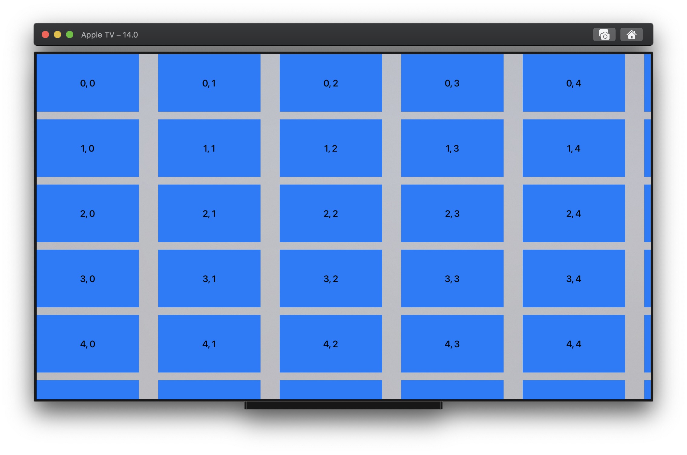
The real downside of the above SwiftUI implementation is that, unlike UICollectionView, all view bodies are loaded initially, as is appearant when you profile the code with Instruments:
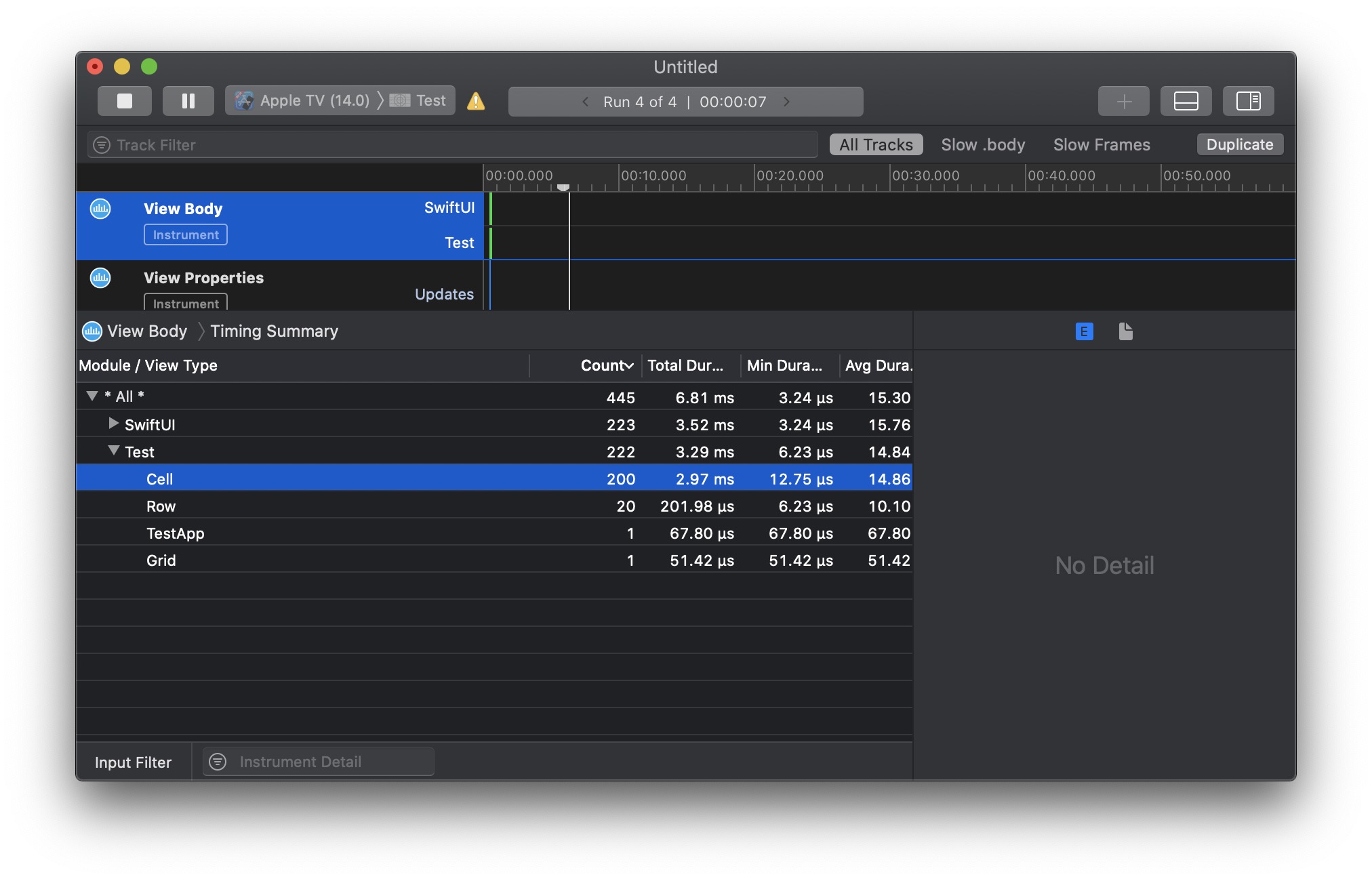
Surely this is not optimal from a performance and memory consumption point of view, and fortunately Apple’s engineers probably thought the same.
Better SwiftUI Grid Layouts With Lazy Stacks
This year SwiftUI introduces lazy variants of stacks in iOS and tvOS 14. Seems like magic when you watch WWDC 2020 10031 where they are presented in action, but you still have to be somewhat careful about which stacks you promote to laziness.
In our case only the outermost stack should be made lazy so that each row height can be properly calculated:
struct Cell: View {
    let row: Int
    let column: Int

    var body: some View {
        Text("\(row), \(column)")
            .frame(width: 320, height: 180)
            .background(Color.blue)
    }
}

struct Row: View {
    let index: Int

    var body: some View {
        ScrollView(.horizontal) {
            HStack {
                ForEach(0..<10) { i in
                    Cell(row: index, column: i)
                }
            }
        }
    }
}

struct Grid: View {
    var body: some View {
        ScrollView {
            LazyVStack {
                ForEach(0..<20) { i in
                    Row(index: i)
                }
            }
        }
    }
}
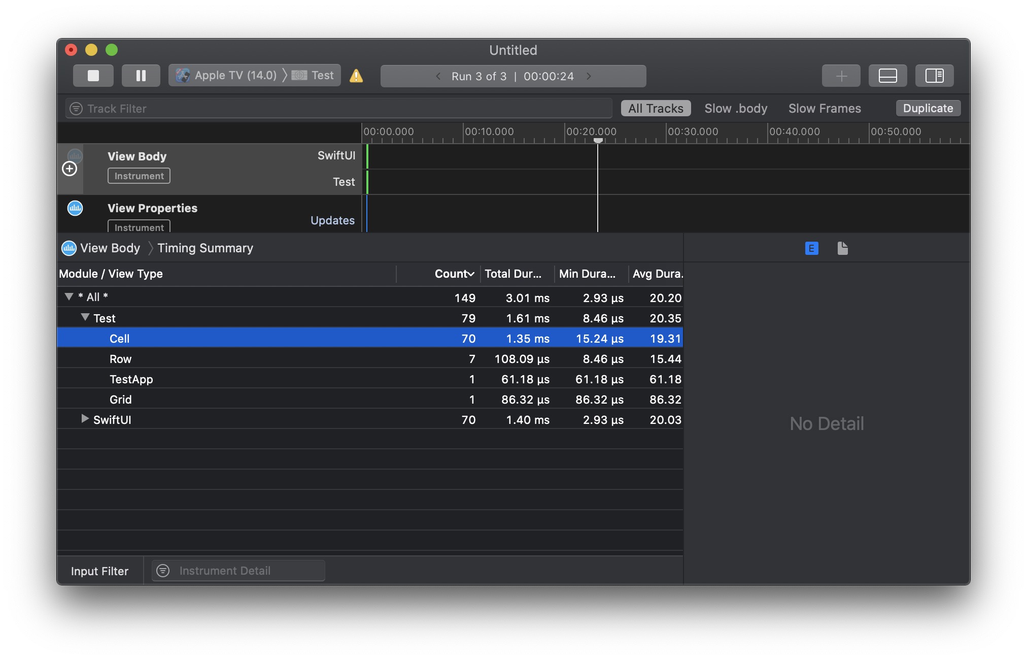
When profiled with Instruments we clearly see an improvement:
Pretty nice until now, isn’t it?
Remark
Though iOS and tvOS 14 also introduce lazy grids with similar behavior, those are not suited for our shelf-based layout as they currently do not support independently scrollable rows.
The Problem with SwiftUI Stack-based Grid Layouts
What is not immediately apparant with the code above is that, while you can easily navigate this grid on iOS by swiping the screen, you cannot do the same on tvOS. There is namely no focusable item in the layout code above, therefore no way to navigate the collection on Apple TV.
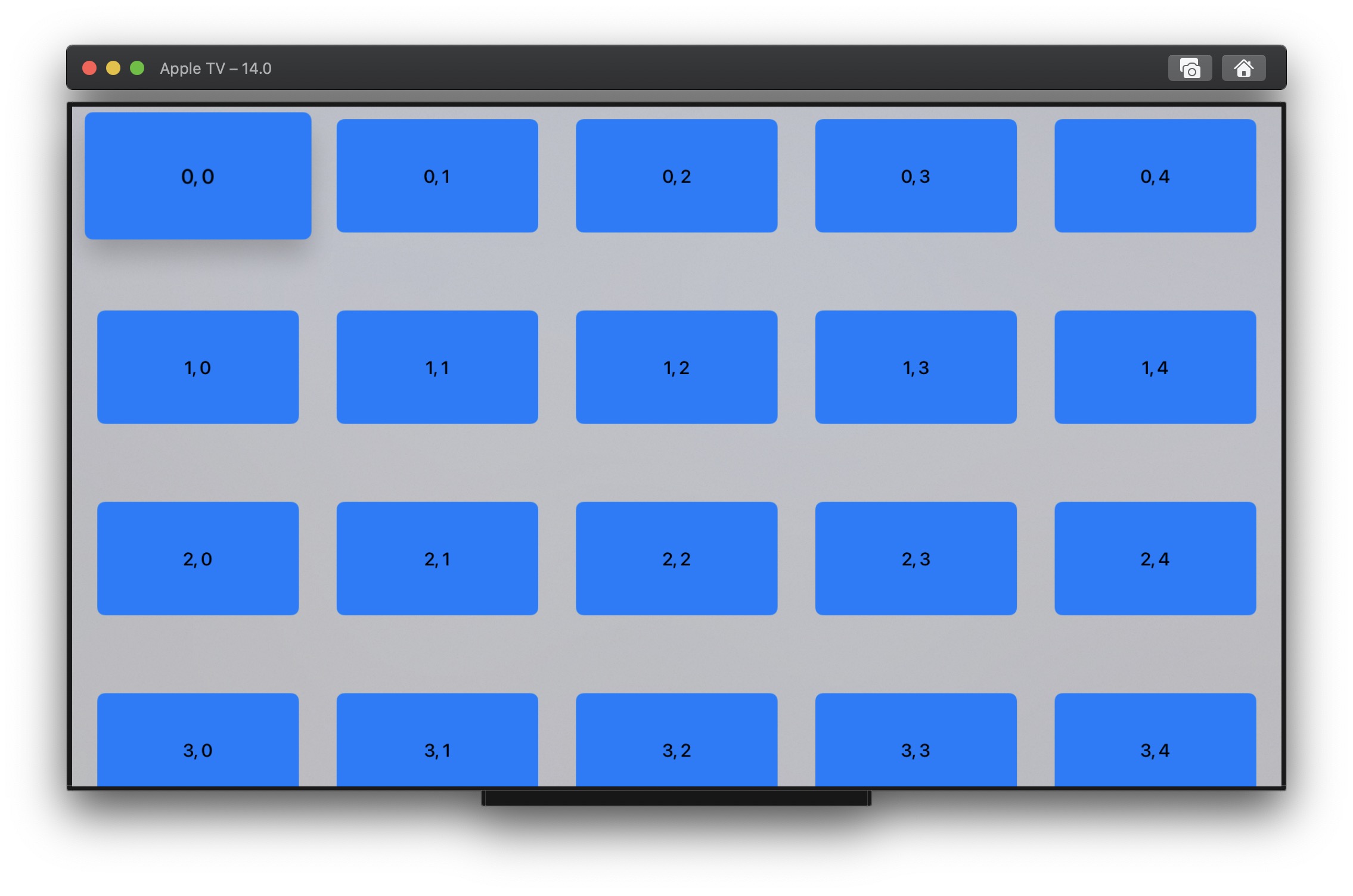
Fortunately it is very easy to make cells focusable by turning them into buttons. We can even have standard look and feel with the new tvOS 14 card button style, which makes focused buttons pop out with a large shadow underneath and tilting support.
Since focus makes the button larger and adds a large shadow to it, I tweaked the margins to let the content shine when focused, but otherwise the code is identical to the one above, except for an added button wrapper in cells. Note that this code only runs on tvOS 14, as the button style is only available there (it is quite easy to make the code compatible with iOS 13 and tvOS 13, but this is left as an exercise for the reader):
struct Cell: View {
    let row: Int
    let column: Int

    var body: some View {
        Button(action: {}) {
            Text("\(row), \(column)")
                .frame(width: 320, height: 180)
                .background(Color.blue)
        }
        .buttonStyle(CardButtonStyle())
    }
}

struct Row: View {
    let index: Int

    var body: some View {
        ScrollView(.horizontal) {
            HStack {
                ForEach(0..<10) { i in
                    Cell(row: index, column: i)
                }
            }
            .padding([.leading, .trailing], 40)
            .padding(.top, 20)
            .padding(.bottom, 80)
        }
    }
}

struct Grid: View {
    var body: some View {
        ScrollView {
            LazyVStack {
                ForEach(0..<20) { i in
                    Row(index: i)
                }
            }
        }
    }
}
We can now navigate the collection and enjoy the native tvOS behavior we expect according to the Human Interface Guidelines:
UICollectionView excels at ensuring smooth scrolling for large data sets by reusing cells as the view is scrolled. Stacks initially introduced by SwiftUI load all content at the same time, but surely lazy variants added this year are supposed to address this issue, aren’t they?
To verify this assumption it suffices to tweak the code above and to load 20 rows of 50 items instead. If you attempt to run the result on an Apple TV device you will clearly experience severe issues. Scrolling performance namely degrades fast with increasing number of items and the user experience becomes horrendous, even with the basic cells we display. You can also notice that lazy stacks do not work well on tvOS, as they force the focus to move one item at a time near collection boundaries.
Remark
If you run the code above on iOS (without the card button style which is available for tvOS only), the experience is better overall:
- Scrolling is smoother, which does not mean that it is anywhere the performance of a
UICollectionViewdisplaying the same number of items. - It is possible to move more than one item at a time near view boundaries since only swipes are involved for navigation.
Without having the time to dig into what actually makes things worse on tvOS, I conjectured these issues are related to tvOS focus changes, which trigger @Environment updates probably leading to additional layout work. This is something we will discuss again in part 2 of this article series but, if I am correct, I think this problem can likely be solved in a future SwiftUI release. Still we must find a solution in the meantime.
Wrapping Up
SwiftUI grid-based layouts made of nested stacks and scroll views currently suffer from major performance issues. On tvOS these performance issues are so significant that attempting to load a few hundred items leads to a poor user experience. Loading thousands of items can bring an Apple TV to its knees.
I reported this problem to Apple during the iOS and tvOS 14 beta phase, knowing it would likely not be fixed in the official releases, and considered the available options:
- Blissful optimism: Do nothing, continue to work with nested stack and scroll views, and hope that later iOS and tvOS releases fix the issue. In the meantime put an upper bound on the amount of content we display in grids, a couple hundred items at most.
- Complete pessimism: Consider SwiftUI is not mature enough and use UIKit.
- Compromise: Use SwiftUI where possible but find a way to solve collection performance issues.
Having tasted how great working and thinking in SwiftUI can be, the mere idea of dropping it entirely was disappointing, especially knowing it can be integrated with UIKit fairly easily. Putting upper bounds to the amount of items displayed was not acceptable either. I therefore decided to go with the compromise and roll my own collection, knowing I would probably learn a lot along the way.
Read next: Part 2: SwiftUI Collection Implementation